
“Mobile friendly” and “responsive” aren’t just the industry’s latest buzzwords—they’re now the wave of the future. These concepts have quickly taken over the marketing industry, and adoption rates have soared to over 60% in the past two years alone. Though both are rising in popularity, the two terms should not be used interchangeably, as they each offer their own unique benefits.
Mobile-friendly
A mobile-friendly website is one that functions the same across all devices. The site’s layout remains static on both a computer and mobile device and typically offers simplified navigation features. Though fewer features are usually displayed on the screen at once, they are often large enough so that user interaction or visibility is not impaired. Not sure if you have a mobile-friendly website? Luckily, Google offers a free feature where anyone can test their site for mobile responsiveness through a webmaster tool. Simply paste your URL into the designated space and click “Analyze.” This tool will not only tell you if your website is mobile-friendly, but if it is not, it will list the reasons why as well.
Responsive design
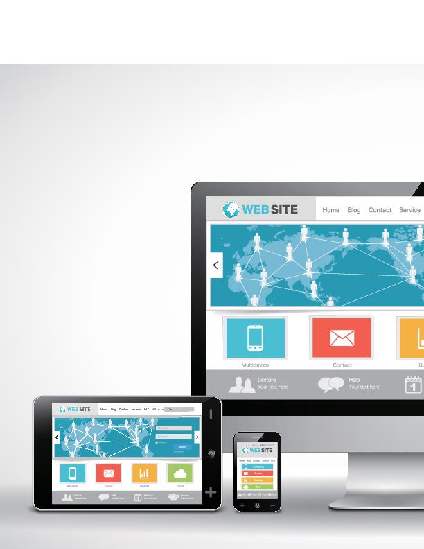
A responsive website is one that adapts based on the device being used to view it. This could include layout changes, hidden images, menu changes, and even re-sizing to ensure that the most important information is presented on the active webpage. Unsure if your website is responsive? Try viewing it on your computer and reducing your browser’s window size. Does it reformat to the reduced screen size? If the answer is yes, then congratulations! You have a responsive website!
Which is better for you?
A responsive website is one that adapts based on the device being used to view it. This could include layout changes, hidden images, menu changes, and even re-sizing to ensure that the most important information is presented on the active webpage. Unsure if your website is responsive? Try viewing it on your computer and reducing your browser’s window size. Does it reformat to the reduced screen size? If the answer is yes, then congratulations! You have a responsive website!
Rentbot can help.
What if I told you that you can have the best of both worlds—a mobile-friendly and responsive website right at your fingertips? By choosing Rentbot, you’ll be provided with your very own custom website, offering online rent payments, maintenance requests, contact features and more in just a matter of days. But that’s not all! At Rentbot, we know that 91% of all apartment shoppers will likely use a mobile device during their next apartment search. That’s why each Rentbot site is automatically equipped with a mobile and responsive design to ensure that your site can be seen on every device every time.
Tap into your mobile market with Rentbot and secure better leads and sign more leases in no time!
About the Author
Jonsette Calloway joined the Rentbot team in 2015. With a background in public relations, advertising and copywriting, she has helped a multitude of clients achieve their marketing and communications goals within various fields, but she particularly enjoys working with the apartment industry.